
In stores this week: Black Magick #1!
Black Magick is a crime/police procedural and occult mystery series, published by Image Comics and created by writer Greg Rucka and artist Nicola Scott.
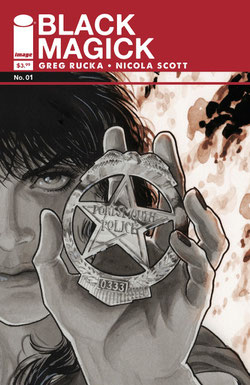
BLACK MAGICK #01
Written by: Greg Rucka
Art by: Nicola Scott (w Chiara Arena)
Lettering by: Jodi Wynne
Logo and Book Design: Eric Trautmann
Cover A by: Nicola Scott (w Eric Trautmann)
Cover B by: Jill Thompson
Magazine Edition Cover by: Rick Burchett
The hammer falls this Halloween! From New York Times bestselling and Eisner Award-winning writer GREG RUCKA (LAZARUS, Stumptown, Gotham Central) and superstar artist NICOLA SCOTT (Birds of Prey, Secret Six, Earth 2)! Detective Rowan Black works robbery/homicide for the Portsmouth PD, but her greatest mystery is the truth about herself...both who she has been, and who she will become. Yet there are others in Rowan's world with very long memories, and the power that one person holds, another will always covet. PLUS, each issue also features an all-new work of original fiction by GREG RUCKA! A new gothic-noir ongoing series about legacy, destiny, redemption...and the price of magic.
Image Comics | Color | Mature Readers | $3.99 (regular & variant); $5.99 (magazine edition)
As with Lazarus (also by Greg Rucka), I'm the series' "designer," which seems like an atypical and somewhat uncommon role in comics (though more common at Image, thankfully).
My role is to take Nicola's cover art, for example, and add appropriate color and trade dress (which I also designed), and lay the cover out for production. I also tackle the design chores on anything that isn't a comic page—the credits, the creator bios, the letter column, and even typsetting some serialized fiction that will be running through the series as it progresses. It's a good gig.
I do a lot of that kind of work on Lazarus, too, but Black Magick is the first time I had a free hand to design the overall "look" of the book. With Lazarus, co-creator/artist Michael Lark had a strong design in mind already, and it was my task to implement it. He'd designed the logo, as well, so I more or less was batting cleanup on the first few issues, gradually tweaking the design work as the series went on.
I went through several preliminary design passes on the logo and trade dress before I even attempted submitting designs to the Black Magick team. For grins, I'm including them here.
FIRST ATTEMPT

The first attempt at the logo design is something I nicknamed the "blurted out" version. I was looking at old books on prestidigitation and sleight-of-hand, and the typeface I chose here was reminiscent of those. So, contextually wrong for the story, and it reads a little too "Magic: The Gathering," while simultaneously being stuffy and dull.
THE "ABRACADABRA" PHASE
Prelim 2 was an attempt to mine the noir, pulp-crime sensibilities of the story, so I tried an Art Deco typeface, and monkeyed around with it a bit. I like the look of it, but it still reads too much like a stage magician's poster.

Same problems as the prior versions: not quite right, in terms of tone, and the awkward perspective would likely be at odds with cover art, and other necessary trade dress, like the Image Comics logo (about which more later).
AND NOW FOR SOMETHING COMPLETELY DIFFERENT…

Black Magick artist Nicola Scott had sketched some preliminary ideas of her own (and you can see some of them in the bonus material in the Magazine edition of Black Magick No. 01, plug
plug hint hint) that included the use of runes as primary letter forms. Here, I attempted to blend an old 1930s poster typeface with hand-drawn "rune"-ish letters, to horrifying,
unreadable effect.
I was started to get really frustrated here.

No.
Just…no.
Every design I do goes through this process. I call this "The Ugly, Desperate Phase."

I like this one a lot (and I ended up using a cleaner version of this typeface on some of the interior bits—specifically on an image of an old, tattered spellbook page), but up front on the cover, it reads too antique for a contemporary story.
ZEROING IN

Now we're getting somewhere. The older poster typeface from the "rune" design returns. The box/inverted type started to get me thinking about police forms and casebooks, and it occurred
to me that, since there's going to be supernatural stuff on the cover, the logo needed to cement the otherwordly aspects of the setting in a contemporary context.
At this point, I started looking at scans of old police manuals and crime/pulp covers, and without any further drafts, leapt immediately to the final design and structure of the covers.
THE BOFFO FINISH

I took a slightly more modern typeface—Alte Haas Grotesk Bold, which has a nice Helvetica feel to it, but with softer, slightly curved edges. It feels clean and modern, but has a touch of age to it, too.
The team seemed to like it, so that was a definite plus. Especially when it's in situin the trade dress...

Taking cues from old pulps, I decided the solid, bright color background would be featured on each of the regular covers with each issue using a different color than the prior release. Issue 1 is red, issue 2 is blue, issue 3 is purple, etc.
That color is also used in the interior design pages and back cover, too, tying everything together.
It was also important to me to incorporate the Image logo into the design; everything is on a sort of grid, with the Image logo, price and issue number forming a vertical line which acts to anchor the trade dress, and the logo and credits drawing the eye horizontally.
One of the challenges in designing the covers for Lazarus is finding the right spot for the Image logo, issue #, and so on. I wanted to really integrate that stuff into the trade dress, as it makes for a nice, consistent look without distracting from the cover art, and it simplifies the workflow when it comes time to actually get work done.